I’ve been using Drafts on both iPhone and Mac since the Mac app launch and am very happily moving my note collection into Drafts, using it as a central repository for all my notes for the first time.
Since using the Mac app as well as the iPhone app, I’ve noticed small issues related to tabular displays of data: text, spaced by the keyboard tab key on my Mac, don’t always line up when viewed on the iPhone, and vice-versa.
I’ve played around a bit and think that by making the font sizes the same on both apps (both were already using the same font but I prefer the Mac font size a little larger), the problem doesn’t happen.
I’ve been racking my brains but can’t figure out what might the cause (and whether or not it is caused by different font sizes - the font I’m using is a mono-spaced font so I can’t think why it would be).
Is anyone able to explain to me a little more about keyboard tab versus the Drafts action tab (https://actions.getdrafts.com/a/1E3) to help me understand the issue I’ve seen - and whether I can avoid it and still use different font sizes on each app?
The Tab action is simply inserting a tab - something not present on the standard iOS software keyboard.
If you are using a fixed width font, and tabs, then the text should always align.
Can you share details of all of your appearance settings on iOS and Mac, along with screenshots of what you have and the sample text shown in the screenshots - I would suggest wrapping the sample tex with two pairs of three back ticks so that the text is preserved:
```
     First Line
    Second Line
      Third Line
```
Might hopefully then show as something like this
First Line
Second Line
Third Line
Once we have the details about your set-up, then even if we were unable to offer an explanation, we can certainly check to see if we can reproduce the sam issue with your set-up and perhaps with corroborating variations in font, etc.
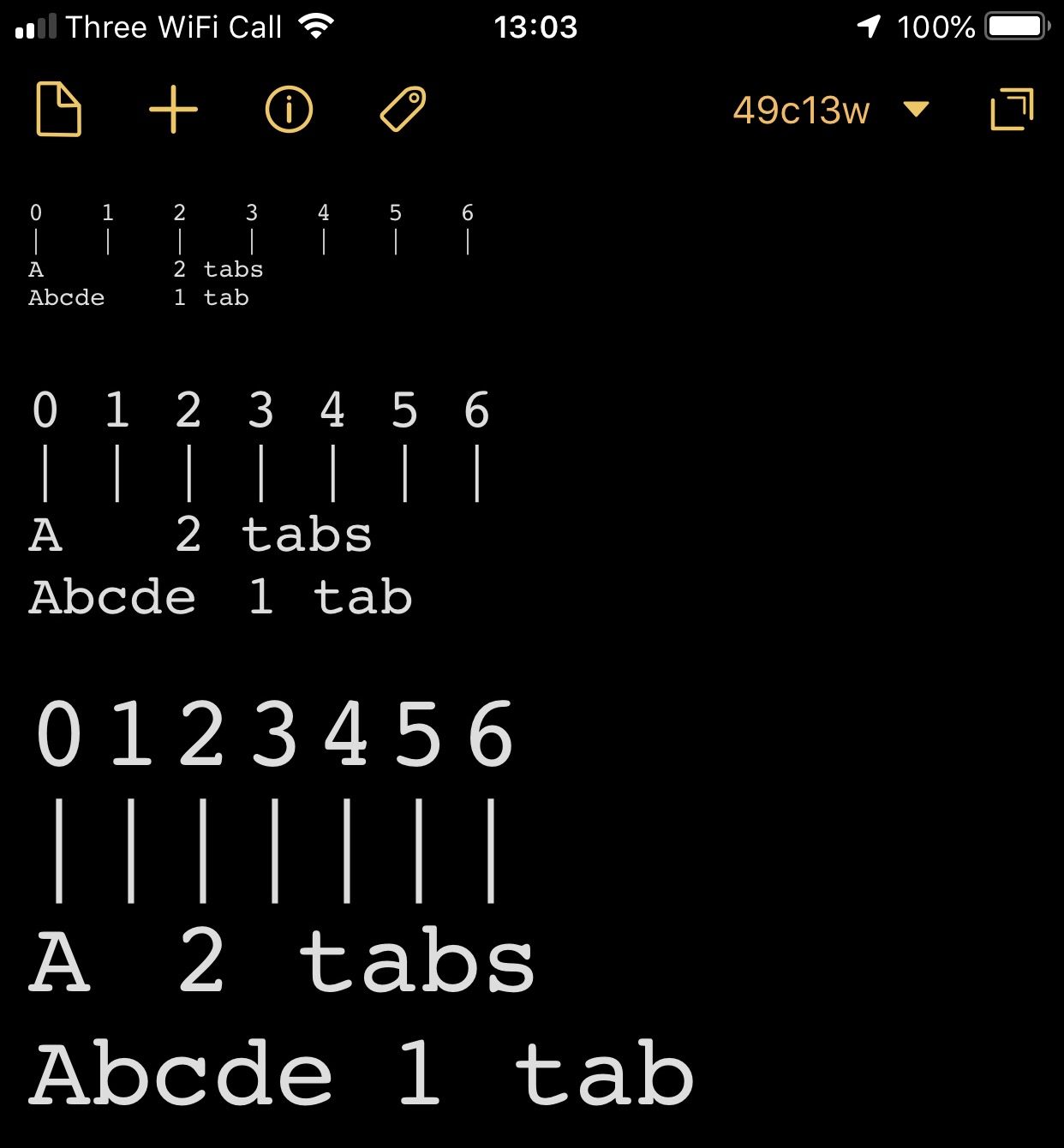
I think the following is a good, simple way to describe the effect I’m trying to understand. An effect which I now think has nothing to do with Mac versus iPhone, and probably nothing either specific to Drafts but is more something about what the tab actually does, and how it responds to changes to font size. The following happens both on Mac using keyboard tab and on iPhone using the insert tab action:
A		2 tabs
Abcde	1 tab
In the first two lines above, the text is seperated by 2 tabs (first line) and 1 tab (second line) and the 2nd ‘columns’ are aligned. If I then increase the font size by 3 points, the spaces changes to be like the following:
A	 2 tabs
Abcde   1 tab
[I’ve spaced those with spaces to make it look like the effect without the need for a screen-shot but the appearence matches the effect].
If I allign the text columns using spaces (and any mono-spaced font), any changes in font-size keeps the columns aligned, because, I guess, spaces are resized along with any characters…
I suspect the problem (or my misunderstanding) comes from how tabs respond to font-size changes, or perhaps that they don’t.
I expect that the way for me to achive what I really want - a way to create aligned columns of data which stay alligned regardless of font-size and of device - is to use spaces rather than tabs. But I’d still like to understand about tabs in case that would help me find a better way!
My setting is for Markdown and I haven’t tried the same thing with other format types. The same thing occurs with tabs whether using a mono-space font of the SYSTEM font.
[I haven’t included full information about my config as I think that the example above can demonstrate the effect I’m seeking to understand without any extra information. If this isn’t the case, I can provide more info on my set-up].
I’ve run a quick test on the iPhone using Courier as a well known fixed width font for the check. I’ve used the same text three times. Once at size 10 (minimum), once at 22, and once at 40 (maximum). I also added in a couple of initial marker lines at each size which are single characters (digits or pipes) separated by single tabs. A composite iPhone-based screenshot of the result is below.
From that I can see that the marker line tabs have only a slight variation in position compared to the more text heavy other lines.
It looks almost like the tabs are in fact based on distances on the screen rather than character width; which would actually match the usual type setting approach that you see in word processors, publishing apps, etc.
I think this potentially is the case, and the discrepancy in the positions might simply be down to a combination of font thickness with the relative positioning to the left side of the screen. But I am just guessing around that.
However, if this absolute positioning vs. relative size scenario is correct, it could certainly explain your observation.
Tab stops are measurement-based. Currently Drafts just uses the default tab stops provided by Apple on both platforms. I’ve had a task open to work on handling this better for a while, but never prioritized it. Will bump up the priority on it to see if I can come up with some more flexible defaults.