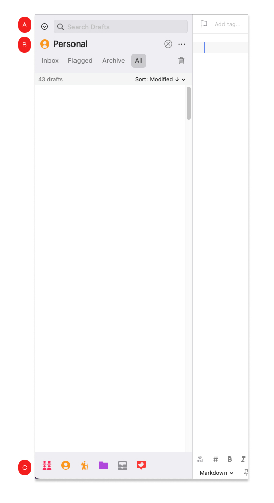
I find that the disconnect between the current workspace title (“B” in diagram) and the dropdown-selector (A) creates confusion. IMO, this is for the following reasons:
- Drafts UI does not consistently differentiate clickable vs. non clickable UI elements via bezel/button/etc.
- Workspace dropdown has no label (if anything, solving this gets us 90% of the way there)
- Some appearances of the workspace icon (B) are not clickable, while some are (C)
Curious if others agree.
Thanks for listening!