Having the option to put the buttons at the bottom near the keyboard would be more efficient than using reachability, but reachability can still be of use when interacting with the text in the draft.
I know about the Reachability function. It’s a workaround for UIs designed for smaller screens. I think it’s about time we saw some major UI changes on iOS. Fingers crossed for iOS 12!
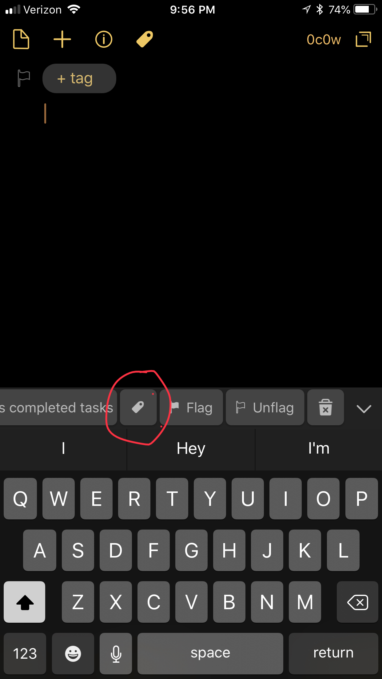
I get where you are going, but I think that idea kind of falls apart when the keyboard is hidden. It’s pretty easy to add a new draft button to the keyboard row, which likely serve 95% of why you would want easier access to those buttons - since the swipe gestures handle access to the drafts and action lists in a reachable way.
It’s primarily the new new draft and the tag buttons I use.
Can I add a tag from the keyboard row?
As for one the keyboard is hidden - yes, that’s a harder design question. I still think, in the long run, it’s worth working towards a UI that doesn’t have controls at the top edge of the screen. Screens are only going to get bigger.